Skip to content

dyce.viz.matplotlib package reference

dyce.viz.matplotlib provides optional, basic Matplotlib-based visualization utilities. Its requirements can be installed via the viz optional dependency group.

1
2
3
pip install 'dyce[viz]'
# or
uv sync --group viz

BurstFormatterT = Callable[[_T, Fraction, H[_T]], str] module-attribute

Callable type for burst-plot wedge labels.

Called as formatter(outcome, probability, histogram). Return an empty string to suppress the label for that wedge.

format_outcome_name(outcome: _T, prob: Fraction, h: H[_T]) -> str

Experimental

dyce.viz.matplotlib.format_outcome_name is experimental; its interface may change or it may be removed in a future release.

Burst-plot formatter that labels each wedge with its outcome. If outcome has a .name attribute (e.g. an Enum), that is used; otherwise str(outcome) is used.

Source code in dyce/viz/matplotlib.py
103
104
105
106
107
108
109
110
111
112
113
@experimental
def format_outcome_name(
    outcome: _T,
    prob: Fraction,  # ruff: ignore[unused-function-argument]
    h: H[_T],  # ruff: ignore[unused-function-argument]
) -> str:
    r"""
    Burst-plot formatter that labels each wedge with its outcome.
    If *outcome* has a `.name` attribute (e.g. an `Enum`), that is used; otherwise `str(outcome)` is used.
    """
    return str(outcome.name) if hasattr(outcome, "name") else str(outcome)  # pyright: ignore[reportAttributeAccessIssue]

format_outcome_name_probability(outcome: _T, prob: Fraction, h: H[_T]) -> str

Experimental

dyce.viz.matplotlib.format_outcome_name_probability is experimental; its interface may change or it may be removed in a future release.

Burst-plot formatter that labels each wedge with both its outcome and probability. If outcome has a .name attribute (e.g. an Enum), that is used; otherwise str(outcome) is used.

Source code in dyce/viz/matplotlib.py
119
120
121
122
123
124
125
126
127
128
129
130
@experimental
def format_outcome_name_probability(
    outcome: _T,
    prob: Fraction,
    h: H[_T],
) -> str:
    r"""
    Burst-plot formatter that labels each wedge with both its outcome and probability.
    If *outcome* has a `.name` attribute (e.g. an `Enum`), that is used; otherwise `str(outcome)` is used.
    """
    name = format_outcome_name(outcome, prob, h)
    return f"{name}\n{format_probability(outcome, prob, h)}"

format_probability(outcome: _T, prob: Fraction, h: H[_T]) -> str

Experimental

dyce.viz.matplotlib.format_probability is experimental; its interface may change or it may be removed in a future release.

Burst-plot formatter that labels each wedge with its probability as a percentage.

Source code in dyce/viz/matplotlib.py
136
137
138
139
140
141
142
143
144
145
@experimental
def format_probability(
    outcome: _T,  # ruff: ignore[unused-function-argument]
    prob: Fraction,
    h: H[_T],  # ruff: ignore[unused-function-argument]
) -> str:
    r"""
    Burst-plot formatter that labels each wedge with its probability as a percentage.
    """
    return f"{float(prob):.2%}"

plot_bar(*hs: H, alpha: float = _DEFAULT_PLOT_ALPHA, ax: Axes | None = None, cmap: str | Colormap | None = None, graph_type: GraphType = GraphType.NORMAL, horizontal: bool = False, labels: Sequence[str] = ()) -> Axes

Experimental

dyce.viz.matplotlib.plot_bar is experimental; its interface may change or it may be removed in a future release.

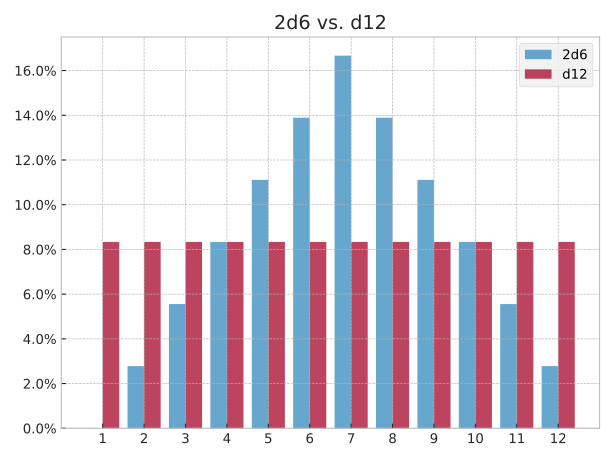
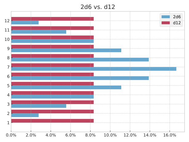
Plots a grouped bar chart of one or more histograms.

Use labels to assign legend names to each histogram.

graph_type controls which variant of the distribution is plotted (see GraphType).

When horizontal is True, bars are drawn horizontally with outcomes on the y-axis and probabilities on the x-axis.

If ax is None, matplotlib.pyplot.gca() is used. Returns the axes so the caller can further customise the plot.

 1
 2
 3
 4
 5
 6
 7
 8
 9
10
from dyce import H
from dyce.viz.matplotlib import plot_bar

ax = plot_bar(
    2 @ H(10),
    H(8) + H(12),
    labels=["2d10", "d8 + d12"],
)
ax.set_title("2d10 vs. d8 + d12")
ax.legend(loc="upper right")

Plot: 2d10 vs. d8 + d12, vertically and horizontally

 1
 2
 3
 4
 5
 6
 7
 8
 9
10
11
from dyce import H
from dyce.viz.matplotlib import plot_bar

ax = plot_bar(
    2 @ H(10),
    H(8) + H(12),
    labels=["2d10", "d8 + d12"],
    horizontal=True,
)
ax.set_title("2d10 vs. d8 + d12")
ax.legend(loc="upper right")

Plot: 2d10 vs. d8 + d12, vertically and horizontally

Source code in dyce/viz/matplotlib.py
152
153
154
155
156
157
158
159
160
161
162
163
164
165
166
167
168
169
170
171
172
173
174
175
176
177
178
179
180
181
182
183
184
185
186
187
188
189
190
191
192
193
194
195
196
197
198
199
200
201
202
203
204
205
206
207
208
209
210
211
212
213
214
215
216
217
218
219
220
221
222
223
224
225
226
227
228
229
230
231
232
233
234
235
236
237
238
239
240
241
242
243
244
@experimental
def plot_bar(
    *hs: H,
    alpha: float = _DEFAULT_PLOT_ALPHA,
    ax: Axes | None = None,
    cmap: str | Colormap | None = None,
    graph_type: GraphType = GraphType.NORMAL,
    horizontal: bool = False,
    labels: Sequence[str] = (),
) -> Axes:
    r"""
    <!-- BEGIN MONKEY PATCH --
    >>> import matplotlib as mpl
    >>> mpl.use("Agg")

      -- END MONKEY PATCH -->

    Plots a grouped bar chart of one or more histograms.

    Use *labels* to assign legend names to each histogram.

    *graph_type* controls which variant of the distribution is plotted (see [`GraphType`][dyce.viz.GraphType]).

    When *horizontal* is `True`, bars are drawn horizontally with outcomes on the y-axis and probabilities on the x-axis.

    If *ax* is `None`, `matplotlib.pyplot.gca()` is used.
    Returns the axes so the caller can further customise the plot.

    === "Vertical bars (default)"

            --8<-- "docs/assets/plot_viz_plot_bar.py:viz"

        <picture>
            <source media="(prefers-color-scheme: dark)" srcset="../assets/plot_viz_plot_bar_dark.svg">
            <source media="(prefers-color-scheme: light)" srcset="../assets/plot_viz_plot_bar_light.svg">
            <img alt="Plot: 2d10 vs. d8 + d12, vertically and horizontally" src="../assets/plot_viz_plot_bar_light.svg">
        </picture>

    === "Horizontal bars (`horizontal=True`)"

            --8<-- "docs/assets/plot_viz_plot_hbar.py:viz"

        <picture>
            <source media="(prefers-color-scheme: dark)" srcset="../assets/plot_viz_plot_hbar_dark.svg">
            <source media="(prefers-color-scheme: light)" srcset="../assets/plot_viz_plot_hbar_light.svg">
            <img alt="Plot: 2d10 vs. d8 + d12, vertically and horizontally" src="../assets/plot_viz_plot_hbar_light.svg">
        </picture>
    """
    hs_list = _labeled_hs(hs, labels)
    ax = _get_ax(ax)
    pct_formatter = mticker.PercentFormatter(xmax=1)
    if horizontal:
        ax.xaxis.set_major_formatter(pct_formatter)
    else:
        ax.yaxis.set_major_formatter(pct_formatter)
    if not hs_list:
        return ax

    unique_outcomes = _sorted_outcomes(hs_list)
    n = len(hs_list)
    bar_width = 0.8 / n
    if unique_outcomes:
        lo, hi = unique_outcomes[0], unique_outcomes[-1]
        if horizontal:
            ax.set_yticks(unique_outcomes)
            ax.set_ylim(lo - 1.0, hi + 1.0)
        else:
            ax.set_xticks(unique_outcomes)
            ax.set_xlim(lo - 1.0, hi + 1.0)
    colors = _colors_linear(cmap, len(hs_list), alpha) if cmap else None
    for i, (label, h) in enumerate(hs_list):
        outcomes, probs = values_for_graph_type(h, graph_type)
        offsets = [o + (i + 0.5) * bar_width - 0.4 for o in outcomes]
        if horizontal:
            ax.barh(
                offsets,
                probs,
                height=bar_width,
                alpha=alpha,
                color=colors[i] if colors else None,
                label=label or None,
            )
        else:
            ax.bar(
                offsets,
                probs,
                width=bar_width,
                alpha=alpha,
                color=colors[i] if colors else None,
                label=label or None,
            )

    return ax

plot_burst(h: H[_T1], compare: H[_T2] | None = None, *, alpha: float = _DEFAULT_PLOT_ALPHA, ax: Axes | None = None, cmap: str | Colormap | None = None, compare_cmap: str | Colormap | None = None, compare_formatter: BurstFormatterT[_T2] | None = None, formatter: BurstFormatterT[_T1] | BurstFormatterT[_T1 | _T2] = format_outcome_name, title: str = '', use_midpoints_for_colors: bool = True) -> Axes

plot_burst(
    h: H[_T1],
    compare: None = ...,
    *,
    alpha: float = ...,
    ax: Axes | None = ...,
    cmap: str | Colormap | None = ...,
    compare_cmap: str | Colormap | None = ...,
    compare_formatter: BurstFormatterT[_T1] | None = ...,
    formatter: BurstFormatterT[_T1] = ...,
    title: str = ...,
    use_midpoints_for_colors: bool = ...,
) -> Axes
plot_burst(
    h: H[_T1],
    compare: H[_T2],
    *,
    alpha: float = ...,
    ax: Axes | None = ...,
    cmap: str | Colormap | None = ...,
    compare_cmap: str | Colormap | None = ...,
    compare_formatter: BurstFormatterT[_T2],
    formatter: BurstFormatterT[_T1] = ...,
    title: str = ...,
    use_midpoints_for_colors: bool = ...,
) -> Axes
plot_burst(
    h: H[_T1],
    compare: H[_T2],
    *,
    alpha: float = ...,
    ax: Axes | None = ...,
    cmap: str | Colormap | None = ...,
    compare_cmap: str | Colormap | None = ...,
    compare_formatter: None = ...,
    formatter: BurstFormatterT[_T1 | _T2] = ...,
    title: str = ...,
    use_midpoints_for_colors: bool = ...,
) -> Axes
plot_burst(
    h: H[_T1],
    compare: H[_T2],
    *,
    alpha: float = ...,
    ax: Axes | None = ...,
    cmap: str | Colormap | None = ...,
    compare_cmap: str | Colormap | None = ...,
    compare_formatter: BurstFormatterT[_T2] | None = ...,
    formatter: BurstFormatterT[_T1] = ...,
    title: str = ...,
    use_midpoints_for_colors: bool = ...,
) -> Axes

Experimental

dyce.viz.matplotlib.plot_burst is experimental; its interface may change or it may be removed in a future release.

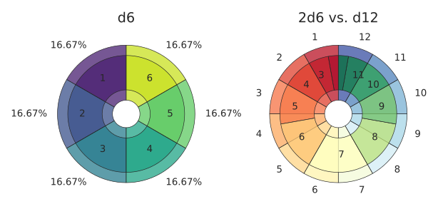
Plots a dual concentric pie chart for one or two histograms, useful for getting a “feel” when comparing distributions.

The inner ring represents h and the outer ring represents compare. When compare is None (the default), both rings show the same histogram: the inner ring labels outcomes (via formatter) and the outer ring labels probabilities. When compare differs from h, both rings default to labelling outcomes This is useful for comparing two related distributions side-by-side in a single visual.

Wedge labels are suppressed when the probability is below Fraction(1, 32) (~3.1%) to avoid clutter.

formatter and compare_formatter are BurstFormatterT callables (see format_outcome_name, format_probability, format_outcome_name_probability).

cmap / compare_cmap accept any matplotlib colormap name or instance. If None, mpl.rcParams["image.cmap"] is used.

If ax is None, matplotlib.pyplot.gca() is used. Returns the axes so the caller can further customise the plot.

 1
 2
 3
 4
 5
 6
 7
 8
 9
10
11
12
13
14
15
16
17
18
19
20
21
from matplotlib import pyplot as plt

from dyce import H
from dyce.viz.matplotlib import plot_burst

ax_d6 = plt.subplot2grid((1, 2), (0, 0))
plot_burst(
    H(6),
    ax=ax_d6,
)
ax_d6.set_title("d6")

ax_2d10_vs_d8d12 = plt.subplot2grid((1, 2), (0, 1))
plot_burst(
    2 @ H(10),
    H(8) + H(12),
    cmap="RdYlGn",
    compare_cmap="RdYlBu",
    ax=ax_2d10_vs_d8d12,
)
ax_2d10_vs_d8d12.set_title("2d10 vs. d8 + d12")

Plot: 2d10 vs. d8 + d12

Source code in dyce/viz/matplotlib.py
303
304
305
306
307
308
309
310
311
312
313
314
315
316
317
318
319
320
321
322
323
324
325
326
327
328
329
330
331
332
333
334
335
336
337
338
339
340
341
342
343
344
345
346
347
348
349
350
351
352
353
354
355
356
357
358
359
360
361
362
363
364
365
366
367
368
369
370
371
372
373
374
375
376
377
378
379
380
381
382
383
384
385
386
387
388
389
390
391
392
393
394
395
396
397
398
399
400
401
402
403
@experimental
def plot_burst(
    h: H[_T1],
    compare: H[_T2] | None = None,
    *,
    alpha: float = _DEFAULT_PLOT_ALPHA,
    ax: Axes | None = None,
    cmap: str | Colormap | None = None,
    compare_cmap: str | Colormap | None = None,
    compare_formatter: BurstFormatterT[_T2] | None = None,
    formatter: BurstFormatterT[_T1] | BurstFormatterT[_T1 | _T2] = format_outcome_name,
    title: str = "",
    use_midpoints_for_colors: bool = True,
) -> Axes:
    r"""
    <!-- BEGIN MONKEY PATCH --
    >>> import matplotlib as mpl
    >>> mpl.use("Agg")

      -- END MONKEY PATCH -->

    Plots a dual concentric pie chart for one or two histograms, useful for getting a “feel” when comparing distributions.

    The inner ring represents *h* and the outer ring represents *compare*.
    When *compare* is `None` (the default), both rings show the same histogram: the inner ring labels outcomes (via *formatter*) and the outer ring labels probabilities.
    When *compare* differs from *h*, both rings default to labelling outcomes
    This is useful for comparing two related distributions side-by-side in a single visual.

    Wedge labels are suppressed when the probability is below `Fraction(1, 32)` (~3.1%) to avoid clutter.

    *formatter* and *compare_formatter* are `BurstFormatterT` callables (see `format_outcome_name`, `format_probability`, `format_outcome_name_probability`).

    *cmap* / *compare_cmap* accept any matplotlib colormap name or instance.
    If `None`, `mpl.rcParams["image.cmap"]` is used.

    If *ax* is `None`, `matplotlib.pyplot.gca()` is used.
    Returns the axes so the caller can further customise the plot.

        --8<-- "docs/assets/plot_viz_plot_burst.py:viz"

    <picture>
        <source media="(prefers-color-scheme: dark)" srcset="../assets/plot_viz_plot_burst_dark.svg">
        <source media="(prefers-color-scheme: light)" srcset="../assets/plot_viz_plot_burst_light.svg">
        <img alt="Plot: 2d10 vs. d8 + d12" src="../assets/plot_viz_plot_burst_light.svg">
    </picture>
    """
    ax = _get_ax(ax)
    h_compare = cast("H[_T2]", h if compare is None else compare)
    if compare_formatter is None:
        compare_formatter = cast(
            "BurstFormatterT[_T2]", format_probability if compare is None else formatter
        )

    def _wedges(
        hist: H[_T], fmt: BurstFormatterT[_T]
    ) -> tuple[tuple[str, ...], tuple[float, ...]]:
        labels_list: list[str] = []
        probs_list: list[float] = []
        for outcome, probability in hist.probability_items():
            label = fmt(outcome, probability, hist) if probability >= _LABEL_LIM else ""
            labels_list.append(label)
            probs_list.append(float(probability))
        return tuple(labels_list), tuple(probs_list)

    inner_labels, inner_probs = _wedges(h, formatter)
    outer_labels, outer_probs = _wedges(h_compare, compare_formatter)
    cmap = mpl.rcParams["image.cmap"] if cmap is None else cmap
    assert cmap is not None
    compare_cmap = mpl.rcParams["image.cmap"] if compare_cmap is None else compare_cmap
    assert compare_cmap is not None
    inner_colors = _colors_proportionate(
        cmap, inner_probs, alpha, use_midpoints=use_midpoints_for_colors
    )
    outer_colors = _colors_proportionate(
        compare_cmap, outer_probs, alpha, use_midpoints=use_midpoints_for_colors
    )
    if title:
        ax.set_title(title, fontweight="bold", pad=24.0)
    if outer_probs:
        ax.pie(
            outer_probs,
            labels=outer_labels,
            radius=1.0,
            labeldistance=1.15,
            startangle=90,
            colors=outer_colors,
            wedgeprops={"width": 0.8},
        )
    if inner_probs:
        ax.pie(
            inner_probs,
            labels=inner_labels,
            radius=0.85,
            labeldistance=0.7,
            startangle=90,
            colors=inner_colors,
            wedgeprops={"width": 0.5},
        )
    ax.set(aspect="equal")

    return ax

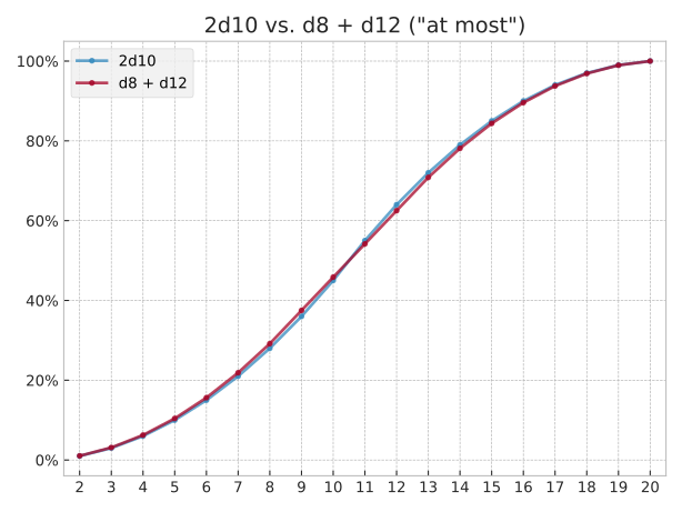
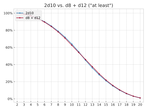
plot_line(*hs: H, alpha: float = _DEFAULT_PLOT_ALPHA, ax: Axes | None = None, cmap: str | Colormap | None = None, graph_type: GraphType = GraphType.NORMAL, labels: Sequence[str] = (), markers: str = _DEFAULT_MARKERS) -> Axes

Experimental

dyce.viz.matplotlib.plot_line is experimental; its interface may change or it may be removed in a future release.

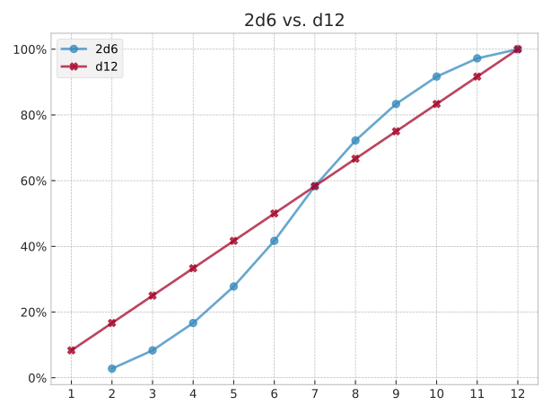
Plots a line graph of one or more histograms.

Use labels to assign legend names to each histogram. Unmatched histograms receive an empty label.

graph_type controls which variant of the distribution is plotted (see GraphType).

markers is a string whose characters are cycled across histograms (e.g. "oX^" produces circle, cross, triangle, circle, …).

If ax is None, matplotlib.pyplot.gca() is used. Returns the axes so the caller can further customise the plot.

 1
 2
 3
 4
 5
 6
 7
 8
 9
10
from dyce import H
from dyce.viz.matplotlib import plot_line

ax = plot_line(
    2 @ H(10),
    H(8) + H(12),
    labels=["2d10", "d8 + d12"],
)
ax.set_title("2d10 vs. d8 + d12")
ax.legend(loc="upper left")

Plot: d6 and 2d10 vs. d8 + d12

 1
 2
 3
 4
 5
 6
 7
 8
 9
10
11
12
from dyce import H
from dyce.viz import GraphType
from dyce.viz.matplotlib import plot_line

ax = plot_line(
    2 @ H(10),
    H(8) + H(12),
    labels=["2d10", "d8 + d12"],
    graph_type=GraphType.AT_MOST,
)
ax.set_title('2d10 vs. d8 + d12 ("at most")')
ax.legend(loc="upper left")

Plot: d6 and 2d10 vs. d8 + d12

 1
 2
 3
 4
 5
 6
 7
 8
 9
10
11
12
from dyce import H
from dyce.viz import GraphType
from dyce.viz.matplotlib import plot_line

ax = plot_line(
    2 @ H(10),
    H(8) + H(12),
    labels=["2d10", "d8 + d12"],
    graph_type=GraphType.AT_LEAST,
)
ax.set_title('2d10 vs. d8 + d12 ("at least")')
ax.legend(loc="upper left")

Plot: d6 and 2d10 vs. d8 + d12

Source code in dyce/viz/matplotlib.py
406
407
408
409
410
411
412
413
414
415
416
417
418
419
420
421
422
423
424
425
426
427
428
429
430
431
432
433
434
435
436
437
438
439
440
441
442
443
444
445
446
447
448
449
450
451
452
453
454
455
456
457
458
459
460
461
462
463
464
465
466
467
468
469
470
471
472
473
474
475
476
477
478
479
480
481
482
483
484
485
486
487
488
489
490
491
@experimental
def plot_line(
    *hs: H,
    alpha: float = _DEFAULT_PLOT_ALPHA,
    ax: Axes | None = None,
    cmap: str | Colormap | None = None,
    graph_type: GraphType = GraphType.NORMAL,
    labels: Sequence[str] = (),
    markers: str = _DEFAULT_MARKERS,
) -> Axes:
    r"""
    <!-- BEGIN MONKEY PATCH --
    >>> import matplotlib as mpl
    >>> mpl.use("Agg")

      -- END MONKEY PATCH -->

    Plots a line graph of one or more histograms.

    Use *labels* to assign legend names to each histogram.
    Unmatched histograms receive an empty label.

    *graph_type* controls which variant of the distribution is plotted (see [`GraphType`][dyce.viz.GraphType]).

    *markers* is a string whose characters are cycled across histograms (e.g. `"oX^"` produces circle, cross, triangle, circle, …).

    If *ax* is `None`, `matplotlib.pyplot.gca()` is used.
    Returns the axes so the caller can further customise the plot.

    === "`graph_type=GraphType.NORMAL` (default)"

            --8<-- "docs/assets/plot_viz_plot_line.py:viz"

        <picture>
            <source media="(prefers-color-scheme: dark)" srcset="../assets/plot_viz_plot_line_dark.svg">
            <source media="(prefers-color-scheme: light)" srcset="../assets/plot_viz_plot_line_light.svg">
            <img alt="Plot: d6 and 2d10 vs. d8 + d12" src="../assets/plot_viz_plot_line_light.svg">
        </picture>

    === "`graph_type=GraphType.AT_MOST`"

            --8<-- "docs/assets/plot_viz_plot_line_at_most.py:viz"

        <picture>
            <source media="(prefers-color-scheme: dark)" srcset="../assets/plot_viz_plot_line_at_most_dark.svg">
            <source media="(prefers-color-scheme: light)" srcset="../assets/plot_viz_plot_line_at_most_light.svg">
            <img alt="Plot: d6 and 2d10 vs. d8 + d12" src="../assets/plot_viz_plot_line_at_most_light.svg">
        </picture>

    === "`graph_type=GraphType.AT_LEAST`"

            --8<-- "docs/assets/plot_viz_plot_line_at_least.py:viz"

        <picture>
            <source media="(prefers-color-scheme: dark)" srcset="../assets/plot_viz_plot_line_at_least_dark.svg">
            <source media="(prefers-color-scheme: light)" srcset="../assets/plot_viz_plot_line_at_least_light.svg">
            <img alt="Plot: d6 and 2d10 vs. d8 + d12" src="../assets/plot_viz_plot_line_at_least_light.svg">
        </picture>
    """
    hs_list = _labeled_hs(hs, labels)
    ax = _get_ax(ax)
    ax.yaxis.set_major_formatter(mticker.PercentFormatter(xmax=1))
    if not hs_list:
        return ax

    unique_outcomes = _sorted_outcomes(hs_list)
    if unique_outcomes:
        lo, hi = unique_outcomes[0], unique_outcomes[-1]
        ax.set_xticks(unique_outcomes)
        ax.set_xlim(lo - 0.5, hi + 0.5)
    colors = _colors_linear(cmap, len(hs_list), alpha) if cmap else None
    markers_cycle_forever = cycle(markers or " ")
    for i, ((label, h), marker) in enumerate(
        zip(hs_list, markers_cycle_forever, strict=False)
    ):
        outcomes, probs = values_for_graph_type(h, graph_type)
        ax.plot(
            outcomes,
            probs,
            color=colors[i] if colors else None,
            label=label or None,
            marker=marker,
            alpha=alpha,
        )

    return ax

plot_ridge(*hs: H[_T], alpha: float = _DEFAULT_RIDGE_ALPHA, ax: Axes | None = None, cmap: str | Colormap | None = None, graph_type: GraphType = GraphType.NORMAL, labels: Sequence[str] = (), overlap: float = _DEFAULT_RIDGE_OVERLAP, peak: float | None = None) -> Axes

Experimental

dyce.viz.matplotlib.plot_ridge is experimental; its interface may change or it may be removed in a future release.

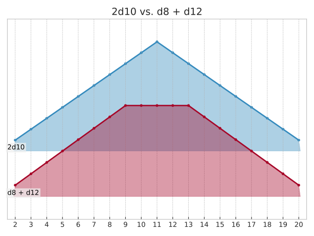
Plots a ridgeline (“joyplot”) of one or more histograms, useful for comparing a family of related distributions, where plot_line would produce a tangle of overlapping curves.

Each histogram becomes its own filled ridge, stacked vertically and offset so that neighbors overlap. Ridges appear top-to-bottom in argument order, and lower ridges are drawn in front of higher ones.

Each ridge covers only its own outcomes. Where a neighbor has an outcome this histogram lacks, the line bridges the gap rather than dipping to zero, since the histogram says nothing there rather than saying zero.

Use labels to name each histogram. Names are drawn inside the plot at their ridge’s baseline, pinned to the left edge, so a long one grows rightward over its own ridge rather than clipping into the margin. Unmatched histograms get a blank label.

cmap accepts any Matplotlib colormap name or instance, sampled evenly to color the ridges. If None, the default line colors associated with the current style are used. Pass mpl.rcParams["image.cmap"] to use the default color map instead.

graph_type controls which variant of the distribution is plotted (see GraphType).

overlap is how many rows tall a ridge at peak stands. At 1.0, such a ridge just reaches the next row's baseline.

peak overrides the percentage drawn at full height, which is otherwise the largest among hs. Pass the largest across several figures to put them all on one scale, so ridges stay comparable between subplots.

If ax is None, matplotlib.pyplot.gca() is used. Returns the axes so the caller can further customise the plot.

1
2
3
4
5
6
7
8
9
from dyce import H
from dyce.viz.matplotlib import plot_ridge

ax = plot_ridge(
    2 @ H(10),
    H(8) + H(12),
    labels=["2d10", "d8 + d12"],
)
ax.set_title("2d10 vs. d8 + d12")

Plot: 2d10 vs. d8 + d12

Source code in dyce/viz/matplotlib.py
494
495
496
497
498
499
500
501
502
503
504
505
506
507
508
509
510
511
512
513
514
515
516
517
518
519
520
521
522
523
524
525
526
527
528
529
530
531
532
533
534
535
536
537
538
539
540
541
542
543
544
545
546
547
548
549
550
551
552
553
554
555
556
557
558
559
560
561
562
563
564
565
566
567
568
569
570
571
572
573
574
575
576
577
578
579
580
581
582
583
584
585
586
587
588
589
590
591
592
593
594
595
596
597
598
599
600
601
602
603
604
605
606
607
608
609
610
611
612
613
614
615
616
617
618
619
620
621
622
623
624
625
626
627
628
629
630
631
632
633
634
635
636
637
638
639
@experimental
def plot_ridge(
    *hs: H[_T],
    alpha: float = _DEFAULT_RIDGE_ALPHA,
    ax: Axes | None = None,
    cmap: str | Colormap | None = None,
    graph_type: GraphType = GraphType.NORMAL,
    labels: Sequence[str] = (),
    overlap: float = _DEFAULT_RIDGE_OVERLAP,
    peak: float | None = None,
) -> Axes:
    r"""
    <!-- BEGIN MONKEY PATCH --
    >>> import matplotlib as mpl
    >>> mpl.use("Agg")

      -- END MONKEY PATCH -->

    Plots a ridgeline (“joyplot”) of one or more histograms, useful for comparing a family of related distributions, where [`plot_line`][dyce.viz.matplotlib.plot_line] would produce a tangle of overlapping curves.

    Each histogram becomes its own filled ridge, stacked vertically and offset so that neighbors overlap.
    Ridges appear top-to-bottom in argument order, and lower ridges are drawn in front of higher ones.

    Each ridge covers only its own outcomes.
    Where a neighbor has an outcome this histogram lacks, the line bridges the gap rather than dipping to zero, since the histogram says nothing there rather than saying zero.

    Use *labels* to name each histogram.
    Names are drawn inside the plot at their ridge’s baseline, pinned to the left edge, so a long one grows rightward over its own ridge rather than clipping into the margin.
    Unmatched histograms get a blank label.

    *cmap* accepts any Matplotlib colormap name or instance, sampled evenly to color the ridges.
    If `None`, the default line colors associated with the current style are used.
    Pass `mpl.rcParams["image.cmap"]` to use the default color map instead.

    *graph_type* controls which variant of the distribution is plotted (see [`GraphType`][dyce.viz.GraphType]).

    *overlap* is how many rows tall a ridge at *peak* stands.
    At `1.0`, such a ridge just reaches the next row's baseline.

    *peak* overrides the percentage drawn at full height, which is otherwise the largest among *hs*.
    Pass the largest across several figures to put them all on one scale, so ridges stay comparable between subplots.

    If *ax* is `None`, `matplotlib.pyplot.gca()` is used.
    Returns the axes so the caller can further customise the plot.

        --8<-- "docs/assets/plot_viz_plot_ridge.py:viz"

    <picture>
        <source media="(prefers-color-scheme: dark)" srcset="../assets/plot_viz_plot_ridge_dark.svg">
        <source media="(prefers-color-scheme: light)" srcset="../assets/plot_viz_plot_ridge_light.svg">
        <img alt="Plot: 2d10 vs. d8 + d12" src="../assets/plot_viz_plot_ridge_light.svg">
    </picture>
    """
    hs_list = _labeled_hs(hs, labels)
    ax = _get_ax(ax)
    if not hs_list:
        return ax

    unique_outcomes = _sorted_outcomes(hs_list)
    if unique_outcomes:
        lo, hi = unique_outcomes[0], unique_outcomes[-1]
        ax.set_xticks(unique_outcomes)  # type: ignore[arg-type] # ty: ignore[invalid-argument-type]
        ax.set_xlim(lo - 0.5, hi + 0.5)  # type: ignore[operator] # ty: ignore[unsupported-operator]
    colors = _colors_linear(cmap, len(hs_list)) if cmap else None
    ridges: list[_RidgeT[_T]] = []
    for i, (label, h) in enumerate(hs_list):
        outcomes, probs = values_for_graph_type(h, graph_type)
        ridges.append(
            {
                "label": label,
                "outcomes": outcomes,
                "probs": probs,
                "baseline": len(hs_list) - 1 - i,  # ordered top-to-bottom
                "color": colors[i] if colors else None,
            }
        )
    peak = (
        max((max(row["probs"], default=0.0) for row in ridges), default=0.0)
        if peak is None
        else peak
    )
    peak_height = overlap * _RIDGE_ROW_STEP
    scale = peak_height / peak if peak else 0.0
    label_transform = mtransforms.blended_transform_factory(
        # Makes sure labels appear at the leftmost edge of the graph, rather than where
        # an outcome of value 0 is or would have been
        ax.transAxes,
        # This is the default (i.e., no change)
        ax.transData,
    )

    for i, ridge in enumerate(ridges):
        crests = tuple(ridge["baseline"] + prob * scale for prob in ridge["probs"])
        (line,) = ax.plot(
            cast("Sequence[float] | Sequence[int] | Sequence[str]", ridge["outcomes"]),
            crests,
            color=ridge["color"],
            marker=_DEFAULT_MARKERS[0],
            zorder=2 * i + 1,  # lower rows are appear in front of higher rows
        )
        red, green, blue = mcolors.to_rgb(line.get_color())
        fill_outcomes = ridge["outcomes"]
        fill_crests: tuple[float | int, ...] = crests
        if fill_outcomes:
            fill_outcomes = (
                ridge["outcomes"][0] - _RIDGE_FILL_FOOT,  # type: ignore[arg-type,operator] # ty: ignore[unsupported-operator]
                *fill_outcomes,
                ridge["outcomes"][-1] + _RIDGE_FILL_FOOT,  # type: ignore[arg-type,operator] # ty: ignore[unsupported-operator]
            )
            fill_crests = (
                ridge["baseline"],
                *fill_crests,
                ridge["baseline"],
            )
        if ridge["outcomes"]:
            ax.fill(
                fill_outcomes,
                fill_crests,
                color=(red, green, blue, alpha),
                zorder=2 * i,  # sits just behind the line
            )
        ax.text(
            0.0,
            ridge["baseline"],
            ridge["label"],
            transform=label_transform,
            ha="left",
            va="bottom",
            zorder=2 * len(ridges),  # on top of everything
            bbox={
                "boxstyle": "square,pad=0.2",
                "facecolor": mcolors.to_rgba(ax.get_facecolor(), 0.72),
                "edgecolor": "none",
            },
        )

    # Baselines are the only reference the rows need, so the y-axis carries no
    # ticks or grid of its own.
    ax.set_yticks([])
    ax.yaxis.grid(visible=False)
    ax.set_ylim(
        -0.5 * _RIDGE_ROW_STEP,
        (len(ridges) - 1) * _RIDGE_ROW_STEP + peak_height + 0.5 * _RIDGE_ROW_STEP,
    )

    return ax